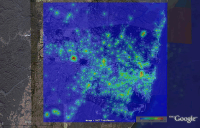
Here are some examples of what can be done, and some datasets that I've collected for work. If you are already using ArcView, or have data in an ESRI file format, and want to be able to view that data in Google Earth, there are some commercial packages around that look quite good, such as Arc2Earth.
I live in, and study, Sydney, mostly, so the following are all specific to Sydney, Australia.
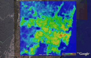
Here is a measure of proximity to commercially zoned land in Sydney. Without going into the exact formula, or the numbers, the warmer colours (on a standard Blue->Red gradient) indicate that there is a lot of commercially zoned land nearby, and the colder colours indicate there isn't much. Generated from publicly available data, from the NSW department of lands (undated, but I assume its current as of around 2001), but with a fair bit of intermediate processing by yours truly.

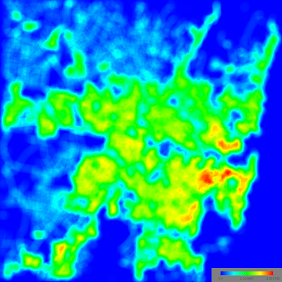
And here is a measure of the amount of land covered by roads in Sydney (warmer colours on a Blue->Red scale indicate higher proportions of road coverage). In general, roads comprise around 30% of the urban area of most cities, but you can see from this that there is significant spatial variation within this for Sydney (and, I am sure, other cities). The exact measure used is the area (in square kilometres) taken up by road within a 1km radius, so the theoretical range is 0 to Pi, but in this picture, deep red is 2.06 square km, or almost exactly 2/3 of the total available land area. As you may or may not be able to see (depending on how well you know Sydney's geography), the areas with the highest road coverage are actually just adjoining the CBD.

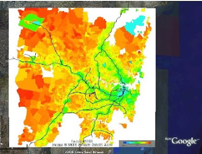
And finally, a map (from ABS 2001 Census data) showing the mode split of journey to work trips in Sydney. Surprisingly, the data here covers almost the entire range, with deep blue being nearly 0% of trips by car, and deep red 100% of trips). The effect of the rail line is pretty evident (note that some of the rail shown by Google is freight lines or otherwise not for passenger use), but there is a lot else going on here -- households without children, for example, are much more likely to live close to rail lines (mostly because they do not have the same strong preference for a detached house and yard) and this household type is less inclined to car use and ownership (independent of whether they live close to a rail line). In short, proximity to rail does have a clear independent effect on car use, car ownership, and mode split, but the graph shown here overstates this effect because household location preferences also relate to transport infrastructure.

How were these created?
Here is the base image file used in the road coverage example above. I generate this with a Java program that:
a) works out from satellite imagery what is road and what isn't
b) works out, for each point on a 5000x5000 grid, what proportion of the area within a 1 km radius is road
c) dumps out a png image showing the proportions.
d) dumps out a KML file that positions the image correctly (lat/long)
All this (barring the 1st step, which can be quite a tricky problem in general, but is made easy in this case for various reasons I wont go into) is pretty easy to do if you know a little programming.

Here is the base image for proximity to commercially zoned land, created with the same software.
Finally, the kml that you need to place the image properly and view it in Google Earth looks something like this: (you will need to change the image URL, and the lat/long for your own purposes).
<?xml version="1.0" encoding="UTF-8"?>
<kml xmlns="http://earth.google.com/kml/2.0">
<GroundOverlay>
<description>NONE</description>
<name>ROAD_COVERAGE_1kmbr.png</name>
<visibility>1</visibility>
<Icon>
<href> http://peter.rickwood.googlepages.com/ROAD_COVERAGE_1kmbr.jpg </href>
</Icon>
<LatLonBox id="ROAD_COVERAGE_1kmbr.png">
<north>-33.55123072596137</north>
<south>-34.08892485815783</south>
<east>151.34688793053158</east>
<west>150.67693273570447</west>
<rotation>0</rotation>
</LatLonBox>
</GroundOverlay>
</kml>

No comments:
Post a Comment