Tuesday, October 28, 2008

So where do people want to live?

Shown below is a picture from some work in progress, where I am looking at the location choice preferences of different household types in Sydney. The picture shows where households with young children (i.e. all less than 15 years) would like to live. The graph shows the spatial variation in preference for detached dwellings only. I do look at the effect of dwelling type, but lets do one thing at a time shall we....

You can pretty safely ignore the scale -- just think warmer colours == 'more desirable'. (If you really want to know, its the log-probability of a couple-with-kids household choosing a dwelling in that region in a discrete choice experiment.... but lets not go there).


And what does it show? Well, couples with kids like the northen harbourside suburbs (i.e. Mosman, and around middle-harbour), and big chunks of the Eastern suburbs (Vaucluse, Centennial Park, etc). No real surprises there.

Other results show that couples with young kids do not like attached dwellings -- they really do want the suburban detached home. Well, most of them anyway.. there is always a distribution of preferences.

And what about couples without kids? The figure (below) shows an estimate for couple households without children where the household reference person is less than 55 years old. They really like the inner-west, dont they?

Tuesday, October 21, 2008

Back to my knitting

After a couple of forays into economic matters, I'll get back to the sort of stuff I normally do.

Below is a map (click the image for bigger version) showing the proportion of journey to work trips made by either walking or bicycle, at the time of the 2001 census. Not surprising to see the huge walk/bike mode share near the city.


Just FYI, the dark blue patch out in the north-west (near Richmond) is an army barracks, so lots of army dudes live near thhe barrackds and stroll in I guess. Same for in the south (near Holdsworthy). Other than that, its basically the CBD (incl. North Sydney) and the University of New South Wales, with Sydney's second CBD (Parramatta) also having a reasonable amount of walking and cycling.

Thursday, June 12, 2008

More on Travel Behavior

Here are a few more graphs showing travel behaviour in Sydney.

The first shows average household VKT. This is estimated in the following way:
1) I estimate a simple household travel model that predicts household VKT based on household type, income, and location.
2) I take data from the 2006 census (which tells us where households are living) and estimate how far they will drive per annum

The model is pretty simple, but the trend is clear.


The above map is interesting, but there is a lot going on -- vehicle use changes with income and household type and location, and these all vary spatially.

Another way of looking at it is to think about the independent effect of location, so, what happens if you take the same household and move that household around. How does their vehicle use vary?

I cant do this exactly, for technical reasons I wont bore you with, but the map below is an attempt to get close. The actual method used to obtain this estimate is a little involved, and involves some guesswork, so dont take it as gospel, but it is at attempt to estimate the independent effect of location. In this instance, I take households from a wealthy area (but not stinking rich, i.e. not Vaucluse/Mosman) that has lots of 'couples with kids' households, and 'move' those households around (en-masse). The following map shows average household VKT when you hold income and household type constant, and change location only. I hope that explanation is comprehensible.


The last map (below) shows average commute time (by origin) in Sydney. This one is compiled as follows:

1) Take ABS journey to work data (They have origin -> destination trip counts by travelzone, which are the spatial regions shown here)

2) Take NSW Transport Data Centre zone->zone travel times (at peak hour).

3) From (1) and (2), calculate average commute per zone.

Again, nothing so surprising here.

Note that the commute time shown here is the average commute for all modes (i.e. car and walk and publilc transport and.. well... everything).


Monday, May 19, 2008

Mode Split, Energy Use, and Job Location

Ever wondered if the presence of rail has much of an effect on mode choice? Yes, I'm sure it keeps you up at night too. Well, wonder no more, I think the following graph is pretty convincing that rail does have an effect:


(If you want to view this in Google Earth yourself, go here for instructions.)

The scale is hard to read, but basically the colour scale is linear, between 0% and 100% (blue to red), with deep blue being 0% of work trips by car, and deep red in areas where 100% of work trips are by car. The base data is from the 2001 Census (ABS).

Of course there is a lot more going on here. Household type varies with proximity to rail stations (in particular, there are fewer households with kids), so the above graph actually overstates the effect of the rail network, but even if you crunch the stats, you get a strong independent effect.

Another important consideration is where jobs are located. Sydney has a strong CBD, in that there are a large number of jobs in and around the CBD, and so a radial rail network provides reasonably competitive access to a large number of jobs. Job decentralisation, which some argue for, on the basis that it will reduce commute length (and energy use), is unlikely to be effective, for the following reasons

  1. Any decentralized job is much more likely to be driven to, because parking will be available, and public transport will be less competitive
  2. While trip length would decrease, it is easy to overestimate the size of this effect. There is plenty of evidence to suggest that substantial 'excess commuting' would continue. For more specialized jobs, decentralizing may well increase commute length, as workers are not substitutable in such cases.
  3. It ignores economics. Firms locate in, or close to, the CBD for good economic reasons (access to large labour pool. agglomeration economies, etc). Trying to force jobs elsewhere (through planning) will likely impose a cost on those firms who are forced to relocate to a less desirable location.
FYI, the following graph shows the commute energy required for each job in the Sydney CBD. That is, it shows, for each zone, the mean number of MJ of transport energy required for workers to get to jobs in that zone. From 2001 ABS Journey to Work data. Energy is in MJ/worker of primary energy (i.e. energy in the ground).


How to view this in Google Earth at home

You need to save the following KML into a plain text file (Notepad will work), save it as whateveryoulike.kml, and then drag and drop this kml file into Google Earth:


<?xml version="1.0" encoding="UTF-8"?>
<kml xmlns="http://earth.google.com/kml/2.0">
<GroundOverlay>
<description>NONE</description>
<name>JTW_CARONLY_PCTbr.png</name>
<visibility>1</visibility>
<Icon>
<href>http://peter.rickwood.googlepages.com/JTW_CARONLY_PCTbr.png</href>
</Icon>
<LatLonBox id="JTW_CARONLY_PCTbr.png">
<north>-33.54141728667299</north>
<south>-34.10141604662701</south>
<east>151.3614161776215</east>
<west>150.65141715537854</west>
<rotation>0</rotation>
</LatLonBox>
</GroundOverlay>
</kml>


Monday, May 12, 2008

Petrol poverty in Sydney

Some of my work got into the popular press recently, which is nice, because, afterall, urban planning/economics is meant to be an applied field. Here is a link to the article, (sans graphics I am afraid). The article got picked up by the peak oil crowd, and you can see a couple of different versions of the graphics here and here, for example, but, for convenience, I've put a scanned version of what appeared in the Sydney Morning Herald below.

Update: Paul Krugman picked this up from the Oil Drum, and stuck it on his blog. This is higher profile than I could've expected. I guess the lesson from this is that, if you want to get exposure, it really helps to gave some pretty/garish graphics....

Here is a low-res scan of the pictures that appeared in the paper(they have been tarted up by the paper, who did a nice job on them, but they are based on maps I produced).

The graphs shows average proportion of gross household income spent on petrol (orange is > 6%, yellow 4-6%, green 2-4%, light blue 1-2%, blue < 1%). Left is with petrol at $1.5 per litre, right is with petrol at $2 per litre (assuming zero price elasticity, just to keep things simple).

A few things to note:

Firstly, because these graphs show averages, they mask a lot of variation at the household level. Some individual households in the orange zone, for example, will be spending a lot more than 6% on fuel, which others will be spending a lot less.

Secondly, these costs are petrol costs only, not vehicle purchase/depreciation, rego, tolls, or other running costs. I took a quick squiz at the latest ABS data (2004 Household Expenditure Survey) which suggests fuel costs to be roughly a third to a quarter of total running costs for cars, on average. With fuel prices up, this proportion is probably a bit out of date, and is also likely to be an underestimate for those in the outer suburbs. Nevertheless, we might expect at least an average of perhaps 15% of gross household income on car travel costs for those in the outer areas, with some households much higher. These sorts of numbers are starting to get pretty significant, and make me think that the housing affordability people should start factoring in transport costs to their measures of affordability. Even if houses on the fringe in Sydney were cheap (which they're not), the extra costs of vehicle purchase and running would make them less affordable, if they were factored in.

The graphs were compiled using a travel model calibrated on NSW Department of Transport Household Travel Survey (3000 households annually across Sydney), so thanks to them. This travel model was applied to the 2006 Census data to work out the graphs you see here. I assume 9 litres per 100km fuel efficiency, because I dont have detailed information about the spatial distribution of the vehicle fleet in Sydney.

Here are the base images I provided to the paper. They're not as pretty as the ones in the paper, unfortunately.


Monday, April 28, 2008

Viewing urban spatial data with Google Earth

For a while now, I have been using Google Earth as my main GIS-viewer. My area of interest is Urban Economics and spatial data processing in general. Although I generally prefer to write my own data processing software (i.e. I don't tend to use the scripting/programming capabilities of programs such as ArcView or MapInfo, I write my own programs for this instead), I still want to be able to view the results, and, for this, Google Earth is great.

Here are some examples of what can be done, and some datasets that I've collected for work. If you are already using ArcView, or have data in an ESRI file format, and want to be able to view that data in Google Earth, there are some commercial packages around that look quite good, such as Arc2Earth.

I live in, and study, Sydney, mostly, so the following are all specific to Sydney, Australia.

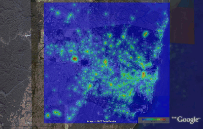
Here is a measure of proximity to commercially zoned land in Sydney. Without going into the exact formula, or the numbers, the warmer colours (on a standard Blue->Red gradient) indicate that there is a lot of commercially zoned land nearby, and the colder colours indicate there isn't much. Generated from publicly available data, from the NSW department of lands (undated, but I assume its current as of around 2001), but with a fair bit of intermediate processing by yours truly.


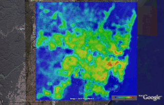
And here is a measure of the amount of land covered by roads in Sydney (warmer colours on a Blue->Red scale indicate higher proportions of road coverage). In general, roads comprise around 30% of the urban area of most cities, but you can see from this that there is significant spatial variation within this for Sydney (and, I am sure, other cities). The exact measure used is the area (in square kilometres) taken up by road within a 1km radius, so the theoretical range is 0 to Pi, but in this picture, deep red is 2.06 square km, or almost exactly 2/3 of the total available land area. As you may or may not be able to see (depending on how well you know Sydney's geography), the areas with the highest road coverage are actually just adjoining the CBD.


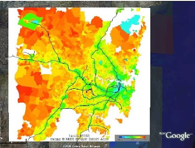
And finally, a map (from ABS 2001 Census data) showing the mode split of journey to work trips in Sydney. Surprisingly, the data here covers almost the entire range, with deep blue being nearly 0% of trips by car, and deep red 100% of trips). The effect of the rail line is pretty evident (note that some of the rail shown by Google is freight lines or otherwise not for passenger use), but there is a lot else going on here -- households without children, for example, are much more likely to live close to rail lines (mostly because they do not have the same strong preference for a detached house and yard) and this household type is less inclined to car use and ownership (independent of whether they live close to a rail line). In short, proximity to rail does have a clear independent effect on car use, car ownership, and mode split, but the graph shown here overstates this effect because household location preferences also relate to transport infrastructure.


How were these created?

Here is the base image file used in the road coverage example above. I generate this with a Java program that:
a) works out from satellite imagery what is road and what isn't
b) works out, for each point on a 5000x5000 grid, what proportion of the area within a 1 km radius is road
c) dumps out a png image showing the proportions.
d) dumps out a KML file that positions the image correctly (lat/long)

All this (barring the 1st step, which can be quite a tricky problem in general, but is made easy in this case for various reasons I wont go into) is pretty easy to do if you know a little programming.


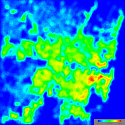
Here is the base image for proximity to commercially zoned land, created with the same software.


Finally, the kml that you need to place the image properly and view it in Google Earth looks something like this: (you will need to change the image URL, and the lat/long for your own purposes).

<?xml version="1.0" encoding="UTF-8"?>
<kml xmlns="http://earth.google.com/kml/2.0">
<GroundOverlay>
<description>NONE</description>
<name>ROAD_COVERAGE_1kmbr.png</name>
<visibility>1</visibility>
<Icon>
<href> http://peter.rickwood.googlepages.com/ROAD_COVERAGE_1kmbr.jpg </href>
</Icon>
<LatLonBox id="ROAD_COVERAGE_1kmbr.png">
<north>-33.55123072596137</north>
<south>-34.08892485815783</south>
<east>151.34688793053158</east>
<west>150.67693273570447</west>
<rotation>0</rotation>
</LatLonBox>
</GroundOverlay>
</kml>